Saturday, 21 August 2010

image selection and representations


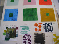
I chose work from four artists Matisse Klee Picasso and Van Gogh as the starting points for this exercise. Using water colour crayon and collage techniques I explored images from sections of the work through a 5cm viewer and then let my work get a little larger as I went on.
I chose Matisse because he had arrived at the start of this module when I watched the t.v programme about him. Also his vibrant colour and use of shape is wonderful. The resulting shapes kept taking me underwater to the sight of wonderful kelp beds and coral reefs I have swum amongst here and in New Zealand. Smooth texture fluidity movement are all things I wanted to capture.
The Van Gogh piece on willows is because I planted 400 willows this Spring and their colours and forms are just starting to develop and cause me great excitement ! I struggled to capture the depth of colour in my pieces
Picasso was chosen because here was a woman's figure with wonderful representation of textiles on her and I loved the colour combination - gold black and red. Again my pencils were used with too little pressure and lacked depth of colour but I liked some of the shapes which reminded me of musical notation / scores.

And finally Klee's The Goldfish. I love the colours and mysterious depths of this work and enjoyed working with it.
My own interpretations were primarily from Matisse but I suspect a lot of the emotion of Klee was there for me as my shapes became like coral and seaweed. I loved the coral like ribbons produced with coloured charcoal.
The aquarelle crayon on wet watercolour paper was a good way to explore shadowy effects and then the joy of simple shapes on dark background and the mosaic / stained glass window piece.(This is best seen up against a light source)
I am still thinking about shadow and coloured shadows so cut out the simple c shape and stuck them onto card tubes to catch a shadow underneath, which I painted in. I realise it will get squashed during postage but hope you see the effects.
Finally I wanted to think about white holes or space so chose to crayon in some coloured bands and impose white shapes onto it. Not a great effect but worth a try.

On the whole fun and I was glad to try and decide whether shape / movement or colour was most important to me as I did each piece.

drawings of bone and shell


Drawings of bone and shell came after an afternoon on the beach. the storms and rains of the last day have left everywhere looking washed out and stranded. I used charcoal because this is the only medium I feel happy drawing with. Shapes and shadows were important and colour secondarily.It was only as I gazed at the bleached out fragments that I saw a wealth of blues, mauves and ochres within the fragments.
I tried playing with my new computer photoshop facility and liked the blue shadowy image created.

As I continued to draw I went back to my Henry Moore sources and sketched some shapes from some of his works. The shape and holes in the bone fragments especially seemed to connect with these.
Finally photos I remembered taking three years ago in Connemara seemed worth looking up. One a piece of driftwood stuck up in the sand like an ancient beast and the other shell shapes whose colours I love, and marks left in the sand like shadows of seaweeds.


silk paper bowl with vanishing embroidery technique


I wanted to try the technique of machine embroidery onto a vanishing background. However after the effort of french knots and colour I yearned for neutrality and also with limited colours available in machine thread here - neutral it was !
I had been aware of not having nice papers as a basis for design so having found some long forgotten silk mawata caps in a box I decided to make paper for myself. I moulded this over a large glass bowl, interlacing it with skeletal leaves and silver threads.
When I had constructed the fabric this was applied to the outside of the paper bowl. I wish I had left well alone at that point as the piece was translucent and I was pleased.
However practical considerations such as durability and the ability to repel dust took over and I applied pva and then colourless varnish. This left the piece which had had structure and tension - ie held bowl shape well, much more pliable. Some colour change into cream / sepia took place as well.
I was left a little disappointed with the end result. However it was all an enjoyable learning process and although the piece is not an exploration of colour as such, I have enclosed it for interest.


Tuesday, 17 August 2010

Colour - What have I achieved?

Having completed this section of the work reviewing the samples and even looking at why I reverted to using white and neutrals for my silk paper bowl has been interesting !!


I love colour and working with it even though I realise how much I must learn, think and experiment further.


I was suprised after reading colour meditations and Itten how subconsciously my use of colour has reflected my state of mind and needs through this summer.


I just want to say again that the concept of coloured shadows is wonderful and I would like to use this sometime.


I really prefer working with oils as I like the texture they give - but the samples took weeks to dry and I have no idea what I am doing with them !! Watercolours are great to blend with but I might get lost in fuzziness if I only stuck with them. Gouache and I need more time. I struggled to get past the idea that all I produce is so child like and these paints just reinforced that worry in me.


The use of stitches and colour took me into happier places and most of all the triangular sample on black silk felt creative for me as I loved the combination of shape and colour together.

Monday, 16 August 2010

when is black not black ?


I remembered a book gifted to me about world textiles by Catherine Legrand and was delighted to see how many traditional forms of textile decoration uses black fabric then embellished with sharp bright colours. I chose the Pupeo skirt from Vietnam as inspiration for my pieces of embroidery on black silk.


I was suprised the effect the black background played in the exercise. It seems to highlight the play of one colour off another which is very pleasing. I felt some colours spaced out along the black fared better than others. I usually like blue with black but was disappointed with the effect of blue running stitch it seemed to lose its vibrancy.

I am not usually a pink person but liked the effct of pink and green very much.


keeping on the move


The concept of movement and visual energy in textile design had primarily been linked in my mind to the way a fabric draped and moved. So to use shape / design and experiment with where and how it was placed was fun !!

so here we go with colour !


I did much of this work early on before being able to get hold of a copy of Itten so it is helpful to look at my comments under Itten in Bibliography 1 and under Menz in bibliography 2


I just realise how conscious I need to be about the effect and use of colour in terms of shape space emotion as well as shadow and whether some realistic interpretation of colour is being aimed at.


Because I have worked with dyes for some years I found creating colour wraps easier by creating my own rainbow dyed samples of merino wool and silk. The idea of taking a source image and breaking it down by studying colour has been a great help to me.


I am fascinated by the idea of coloured shadows and would like to return to this idea again.


My first ever watercolour still life (so sorry )but at least a friend thought it might be fruit !


bibliography 2

Henry Moore edt Chris Stephens Tate 2010
I can't tell you what Moore's shapes and shadows do to me except it is better than going through the wardrobe into Narnia !!

Textile Treasures at the Glasgow school of art Liz Arthur Herbert Press 2005 isbn 10 - 0 - 7136 - 7188 - 9 Wonderful resource book stumbled upon in a junk shop. Particularly drawn to naive embroidery - middle European


Color Works - the crafter's guide to color Deb Menz Interweave Press 2004 isbn 1 - 931499 -47 - 0 This has helped break down Itten's work into sections I can get hold of with exercises and shapes given related to spherical colour orb. It is also a lot more easily available and affordable to modern textile students.


Textiles : A World Tour Catherine Legrand Thames and Hudson sorry I could find no isbn or date reference on this book. This is the only fault, for this book is one everyone should own who loves our world. Full of faces and peoples of the world and their textiles. Total inspiration and a joy. I used a photo of the Pupeo skirt from Vietnam as a source when trying out coloured stitches on black silk.

Techno Textiles revolutionary fabrics for fashion and design Sarah E Braddock and Marie O'Mahoney Thames and Hudson

Oh I had no idea !! the world moves on at such a pace and fabric is so much more than I had realised before reading this book.


here are notes random thoughts I want to go back to and refer to.


healing fibres - impregnation of fibres with vitamin c or seaweed extract


perfumes


so that on contact with the skin a sense of healing and well being is more than skin deep !
use of metals and fabrics - contrasts and form wonderful ideas


fibreoptics - in fibre construction - how does this work?


ribbon in woven grid held together with rubber buttons


ecological concerns in manufacture of fabric


renewable resources


what is biodegradable


use of waste products - silk selvedges and polyurethane to create new fabric


importance of textiles to modern world - place in space travel


air travel


sport


cad importance and place of computer in design process


carbon fibre materials and use of sound deadening properties in car design for eg


carbon footprint idea - shape of footprint in metal


Look up Norma Starszakowna - textile designer Dundee university - her Winchester project white on white cloth


Randomly pleat organza - spray on dye


unfold and press flat


Devore technique on velvet - see simple shift dress pg 93


Look up work of Donna Karan


Leaf printed fabric - printed with sunlight on chemically treated fabric see pg 109


see Rebecca Earley - printing design on fabric


see pg 113 design


Isse Miyake - look up "Pleats please"


pleats originated with Egyptians


idea of macrame type fabric over metal frame - shaped and then stiffened - see pg 130


Biomimetics see pg 137 - extraction of good design from nature


Kyoto museum - new textile artists - look up


International Textile design Mary Schoeser Laurence King publisher

A wonderful visual resource but frustrating as many of the techniques eg dobby woven fabric outside my scope and there was little explanatory notes as to design and technique

pointillism or an obsession with French Knots


After creating samples in pastel shades and French Knots I came across some textiles from the Glasgow School of Art museum and was drawn to a panel created by Margaret MacDonald 1904 - 8


The original works are in shades of yellow teraccotta and pink / peach with black accents


I had made some sketches and then found I was creating the embroidery whilst arranging a funeral etc and the colours transmuted without my really knowing why.


The effect is completely different and whilst I think I haven't got the balance and maybe position of the colours right I enjoyed creating this piece enormously. (see also my comments under Itten in bibliography 1)This was a miracle since it took me hours to even create a convincing French Knot ! But once started they became addictive.